
Why does AI keep making everything blue-purple?
One button color from 2020 broke the entire internet

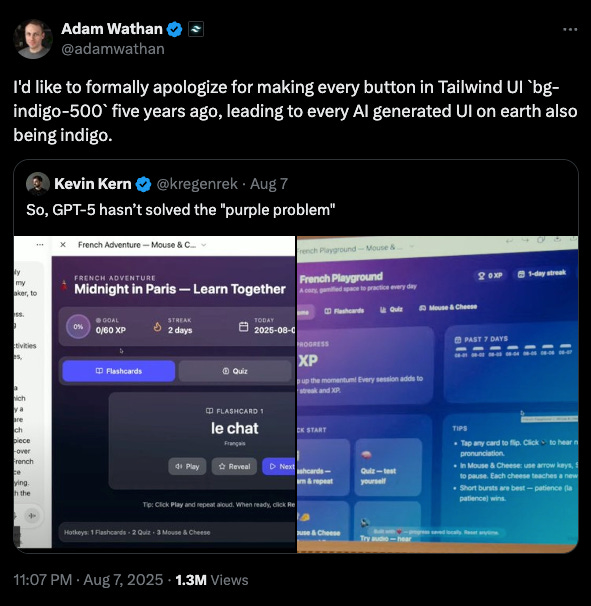
Ask ChatGPT or Claude to create a prototype for a website or even lovable and there is almost a 90% chance it will come back with some blue-purple gradient. The cards? Purple gradient. Buttons? Blue. Navigation bars? You guessed it.
Nobody’s asking for this but the billion dollar machine just can’t help itself. And the reason for this?
It all traces back to Tailwind CSS, which is basically the go to framework for frontend developers. I have no idea about this but I too have been using it lately a lot via Claude Code.
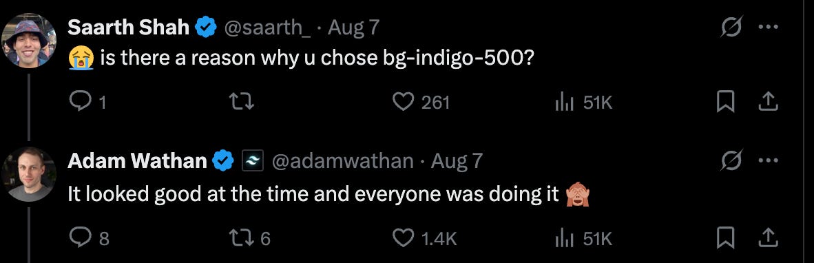
So, about 5 years ago, the tailwind CSS developer set the default color to indigo-500. It made sense to him as it looked good at the time and everyone was doing it.
No big deal, right?
Wrong.
Because here’s what happened: every tutorial, every code example, every “how to build a login page” blog post used that exact same indigo button. And all of that content eventually got scraped into AI training data.
So now AI thinks indigo is just what buttons are supposed to be.
Why this Actually Matters?
It’s not just about generic gradients though. This is a symptom of a bigger issue with how AI learns. When the training data comes from a narrow pool of sources, you get these weird biases baked in. AI doesn’t know if indigo is genuinely the best choice or just the most common one. It only knows frequency.
And if you are a designer who relies heavily on AI, you start thinking there is only one right answer. That’s how creativity dies.
So yeah. Neat time AI suggests yet another blue-purple gradient, just know it’s not being visionary. It is just really, really stuck in 2020.
Good read!!